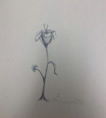
Flower: I used no reference picture so it looks somewhat unrealistic. I had troubles with the petals.
|
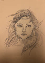
Face: I used a reference picture for the general features, but i did the shading and most of the hair without it.
|
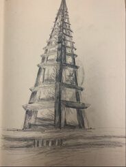
3-Point: I used no reference photo, mostly memory. The lines aren't proportional but I believe its somewhat obvious that it is some sort of tower.
|
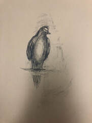
Animal: I again used no reference photo. The proportions of the body and wings was complicated without a picture to work off with, but I think it was generally successful.
|
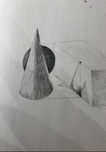
Beginning sketch of shadow/shading practice.
|
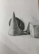
Here I begin to fill in the shading that I saw on the original picture. The overlapping shadows was the hardest to shade in.
|
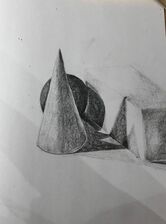
Here I only darkened the shadows on the cube to make it more noticable.
|
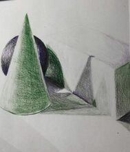
This is a mock drawing except I used only two colors, green and purple. I found the color to be hard to darken and lighten correctly.
|
Still Life Project:
|
|
|
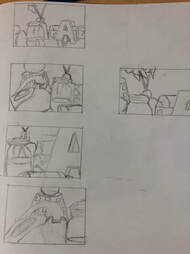
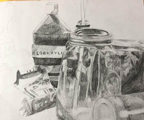
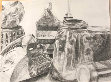
These are the ideas and beginning sketches of the final drawing. The third picture is the final however it is in lighter shades. I found the glass jar and the letters to be the hardest to draw.
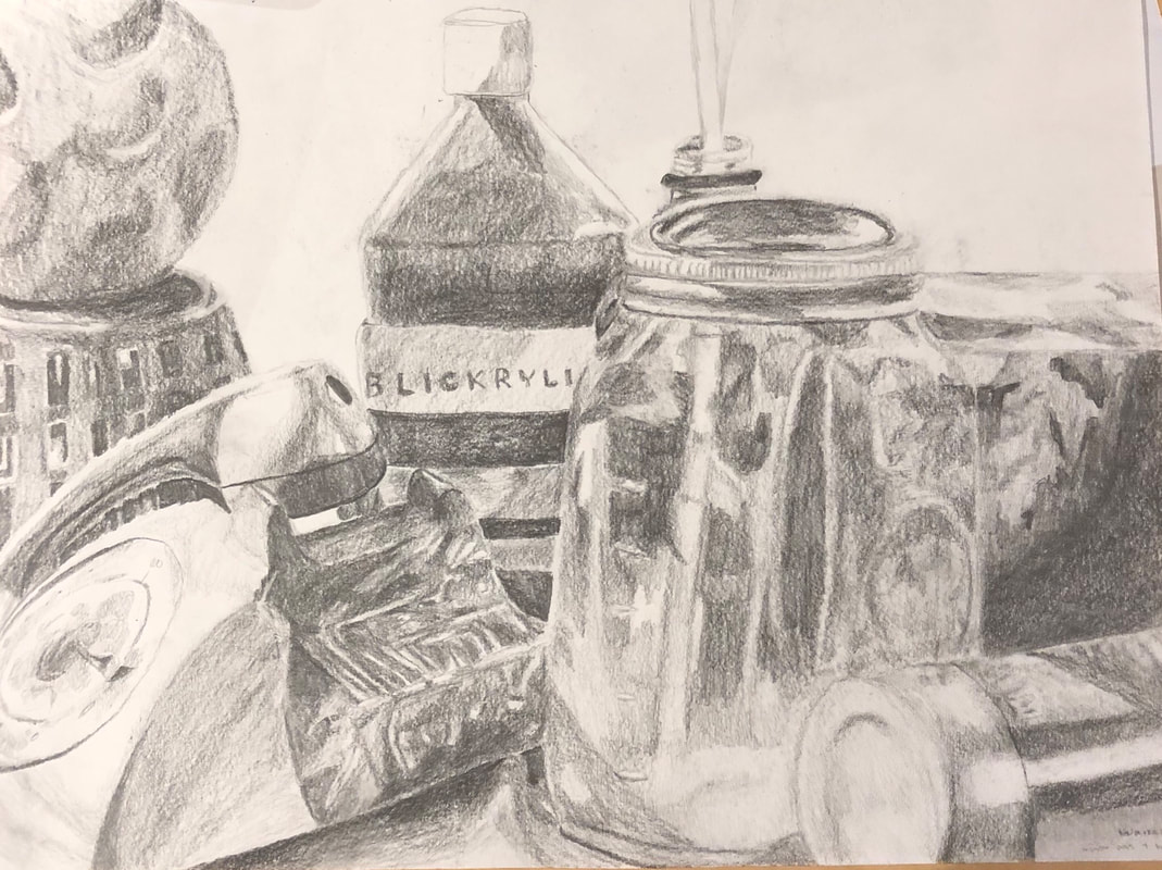
Finished product + Questions:
SELF EVALUATION
Did you use a wide range of values? (A range from white to black with at least 9 values). Explain how is this evident?
I used many different values in this drawing. As you can see, there is a wide variety of blacks, grays, and whites. With the lighter objects in the background, I blended in the white/highlight with the paper itself.
Explain how your knowledge and creating practice studies with value contributed to your piece.
Due to my previous class of drawing and also past experiences with art. I've been able to draw what I see with as much precision as possible, especially with value and its contribution to making art pieces more realistic. Using different shades of the same color I gave the piece the appearance of a light source and also depth.
Describe the blending and transitions in your objects (discuss your use of pressure with pencil and other techniques to achieve this).
I used several different lead types however the concept is the same. In order to make darker shades then the pressure on the pencil must be stronger, and in order to get lighter shades then the pressure should be weaker. It's also important to maintain the same pressure throughout whatever portion of the composition you are drawing to create a smooth transition.
Explain how your interpretation of texture is essential in capturing the look of the object.
I believe the use of highlights within a dark area creates the look of texture within an art piece as well as the use of creating depth. An example would be the ball on top of the basket in my drawing.
If you could recreate your pieces what would you do differently to enhance the final outcome?
I would attempt to make it look more smoother and less messy and some of the proportions are slightly off so I would also change that part of the composition. Other then that I believe it's a successful piece.
SELF EVALUATION
- Describe how you arranged your composition. Discuss your use of the elements and principles. Is it a successful composition?
Did you use a wide range of values? (A range from white to black with at least 9 values). Explain how is this evident?
I used many different values in this drawing. As you can see, there is a wide variety of blacks, grays, and whites. With the lighter objects in the background, I blended in the white/highlight with the paper itself.
Explain how your knowledge and creating practice studies with value contributed to your piece.
Due to my previous class of drawing and also past experiences with art. I've been able to draw what I see with as much precision as possible, especially with value and its contribution to making art pieces more realistic. Using different shades of the same color I gave the piece the appearance of a light source and also depth.
Describe the blending and transitions in your objects (discuss your use of pressure with pencil and other techniques to achieve this).
I used several different lead types however the concept is the same. In order to make darker shades then the pressure on the pencil must be stronger, and in order to get lighter shades then the pressure should be weaker. It's also important to maintain the same pressure throughout whatever portion of the composition you are drawing to create a smooth transition.
Explain how your interpretation of texture is essential in capturing the look of the object.
I believe the use of highlights within a dark area creates the look of texture within an art piece as well as the use of creating depth. An example would be the ball on top of the basket in my drawing.
If you could recreate your pieces what would you do differently to enhance the final outcome?
I would attempt to make it look more smoother and less messy and some of the proportions are slightly off so I would also change that part of the composition. Other then that I believe it's a successful piece.
Pen and Ink Practices:
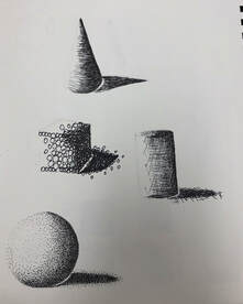
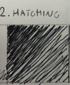
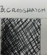
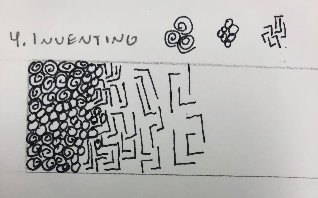
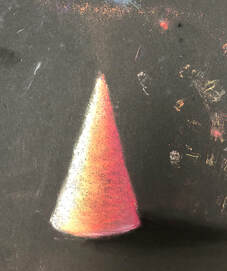
This is the first practice drawing of four main pen drawing techniques. The sphere is the strippling, the cylinder is crosshatching, the cone is hatching, and the cube is inventing. I found the inventing technique to be the hardest.
|
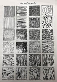
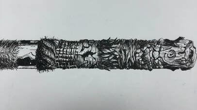
This is the first of the pen and ink practice sheet on different line strokes, patterns, and texture.
|
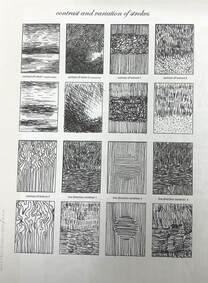
This is the second of the pen and ink practice sheet on different line stokes, patterns, and texture. I found the scribble stroke and contrast of texture (crosshatching) hardest of them all.
|
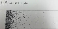
Value of stripling technique.
|
Value of hatching technique.
|
Value of crosshatching technique.
|
Value of inventing technique.
|
This is a practice drawing of different pen and ink textures from a video. I found the hairy/fuzzy textures to be most difficult.
|
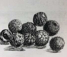
This is another drawing of different pen and ink textures from a video except the shape of the object(s) are different. The cratered and glass/marble textures were the hardest to draw.
|
|
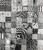
These are 100 squares of different pen and ink patterns.
|
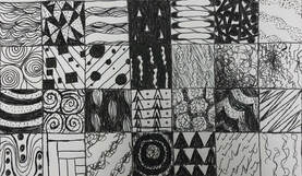
This is a pen and ink practice of drawing and using different patterns to create an image.
|
Pen and Ink Project- Progress and Final
20 Ideas of project.
|
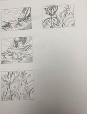
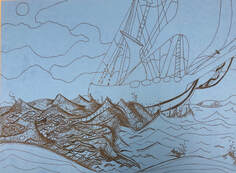
4 composition sketches of two chosen ideas. First of chosen idea was a ship in a stormy ocean. Second was a hand reaching out to a butterfly on a flower(s).
|
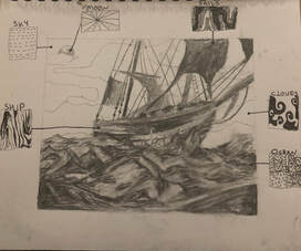
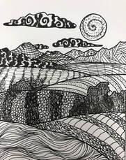
This is the final sketch of what the project will be. I chose the ship in the stormy ocean and the pen designs of the ocean, sky, ship, sails, etc...are on the sides of the sketch.
|
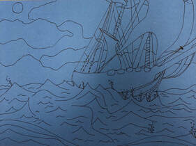
This is the first sketch of the final drawing. Designs and such have been planned.
|
First I started off with the ocean and outlined a few parts of the boat.
|
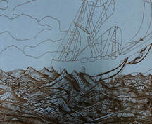
Here I finished the ocean and now i'm starting with the boat. Drawing the highlights of the water was the toughest part of the drawing so far.
|
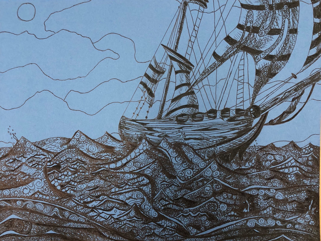
The boat was the second hardest. Getting all the curves/perception of the boat was hard especially the wood but I think I did an overall good job.
|
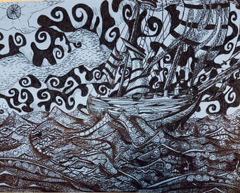
Final Pen and Ink:
SELF EVALUATION
- Describe how you arranged your composition. Discuss your use of the elements and principles. Is it a successful composition?
- How is texture and pattern are important in your composition?
Why is value so important in this project?
It allows the viewer to understand what is going on in the drawing and adds realism. It also gives a sense of a light source.
Describe your craftsmanship (How well the project is crafted technically).
When drawing I focused on one part and moved on to the next which made the drawing easier and faster to finish. When making dark parts/shading, I used smaller patterns packed together with allowed smooth transitions between light and dark. I also made sure to keep the highlighted parts completely blank. When it came to straight lines I made them darker then usual so that it is easier to notice them.
Explain how your knowledge and creating practice studies with value and pattern contributed to the success of your piece.
I've never really used pen and ink before as a main art form. However, I do have some experience with using it and I also have practiced with different patterns and values beforehand
When applying the pen and ink/pattern techniques why and how is it important to make sure you understand the concepts taught in class?
There is a correct and incorrect way of using pen patterns. You have to be careful and pay attention to detail and value more than regular pencil since ink is based on just one solid color. Because of that, it makes it much harder to control how dark and how light your lines/strokes are. That's why it is important to practice using pen/ink before you go deeper into using it.
As a growing artist how do you think what you have learned will guide and better your future projects. Explain.
I now know how to properly use pen and ink. So if I ever had to use pen then it won't be as tough as it used to be. I also have even more experience and can create successful projects in the future.
If you could recreate your piece what would you do differently to enhance your final outcome?
I would want to make the background less messy so that the boat doesn't fade out into the sky. I also think using different designs for the sails and clouds would have made it better. But other then that I would keep it the same.
Pastels-Practice and Finals
|
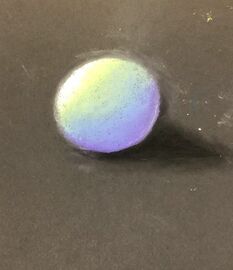
For these two drawings using pastels. I created two shapes with different colors but the technique drawing them is the same. I used a black pastel to create the shadow.
|
|
Finals-
|
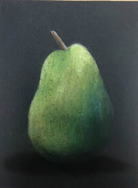
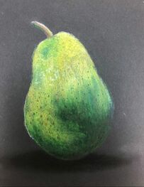
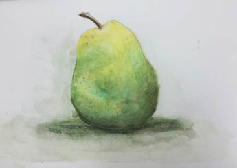
Both drawings are of the same image but using different materials. The darker pear is drawn with pastel colored pencils, while the lighter pear is drawn with pastel chalk. I found the blending with the pastel chalk to be easiest and it looks much more vibrant as well.
|
|
Water Color-Practice and Final
|
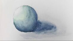
These are drawings/paintings that used watercolor pencils and then water for blending the colors. For some reason, the blue was harder to blend than the red.
|
|
Final-
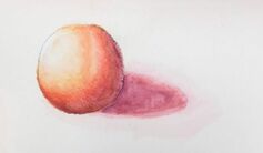
|
This is the final drawing of using water color pencils and water. The image of the pear is the same as the pastels. I found the shading part of the drawing the hardest part. It took awhile for it to become dark.
|
|
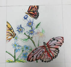
Final Project (Water Color)-Practice and Progress
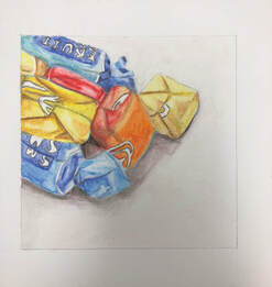
This Is a Practice water color drawing/painting using water color pencils. Here I drew a group of different colored candies. The hardest part of this practice was choosing the colors and how to use them when adding water.
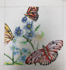
Progress Photos-
This is the first sketch of the final drawing and choosing of the colors that will be used.
|
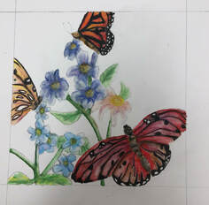
Here is when I began to blend in the colors with water.
|
After blending all the colors, I then put on many different layers of color to make the flowers and butterflies more vibrant.
|
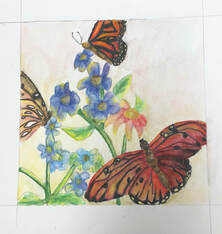
Here I added yellows to create the illusion that light was hitting the flowers and butterflies. I also added color to the background.
|
Final Water Color Drawing-
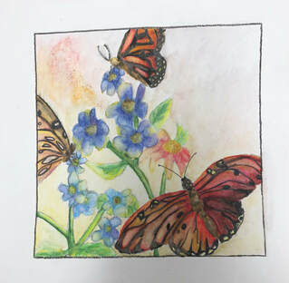
The final drawing of the water color project. The butterflies were the hardest to paint and draw and I think I could of made the flowers more detailed.
Printing- Practice, Ideas, and Final
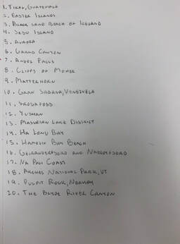
These are 20 ideas of what I would want the printing to be. Out of the 20 I chose three which were Hamlin Bay, Angel Falls, and The Cliffs of Moher.
|
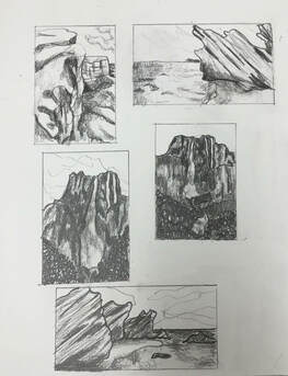
This is the composition sketching of the three ideas that I chose. I decided to use the bottom picture of Hamlin Bay for the printing project.
|
Final Sketches and Carvings-
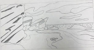
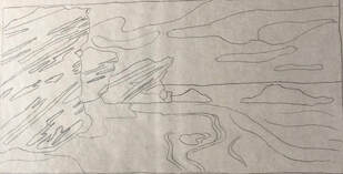
This is the final sketch for the printing project. But a few adjustments will be made for detail.
|
|
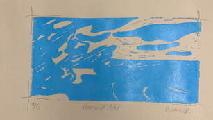
This is the very first print that I did for the blue and the grey (paper).
|
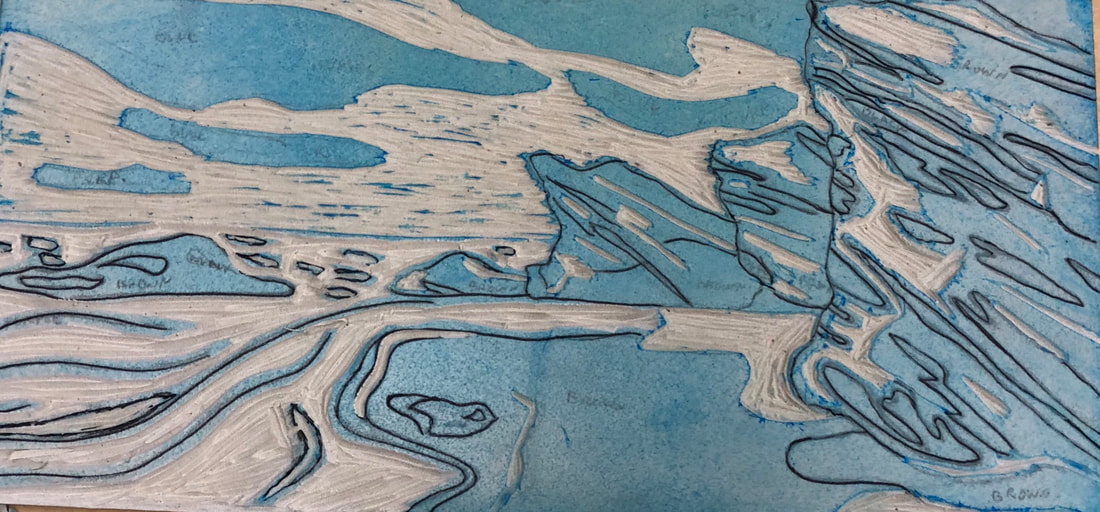
This is the carving for the color purple. Before this carving I had printed the brown.
|
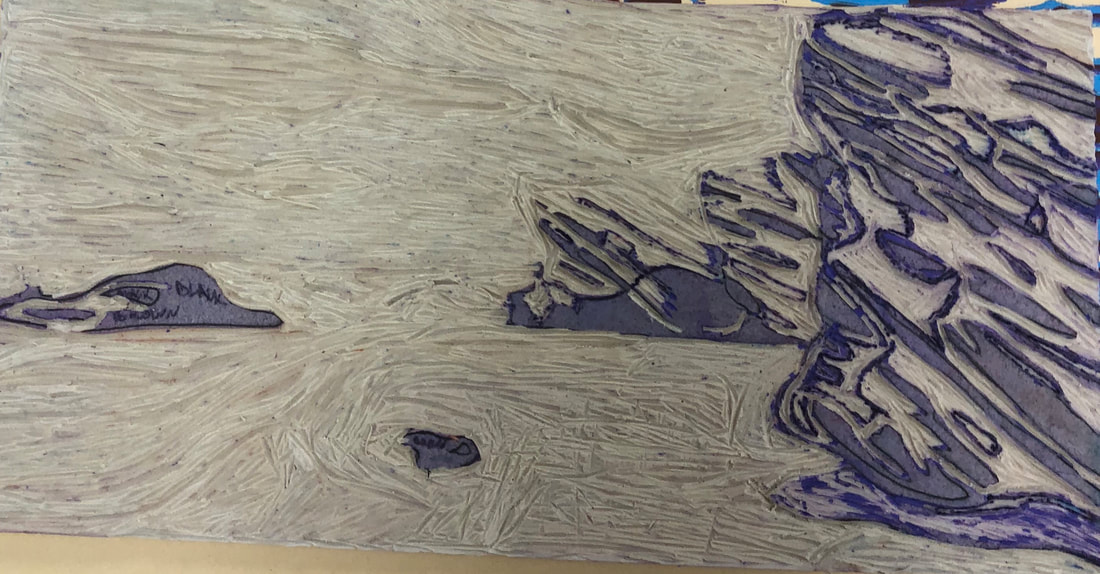
This is the final carving on the linoleum for the color black.
|
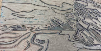
Top Three Final Prints and Questions-
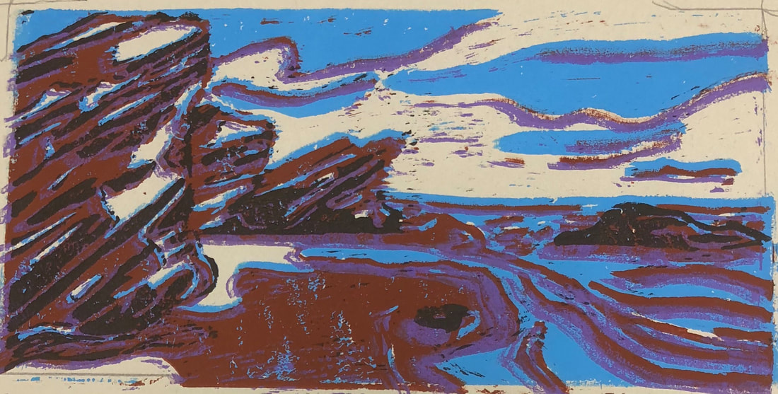
|
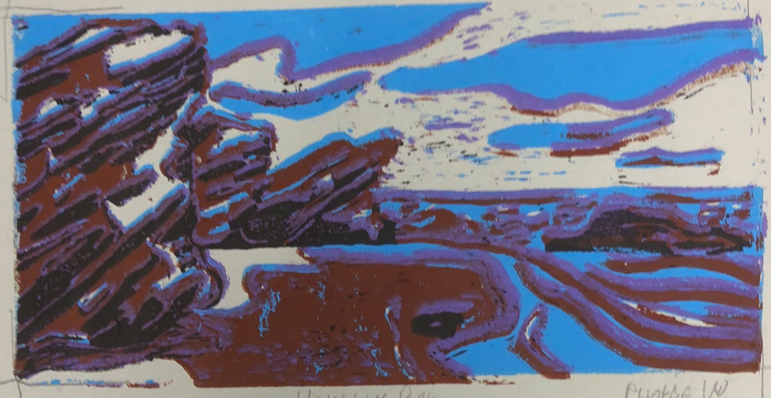
|
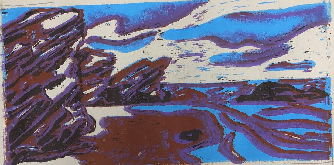
|
SELF EVALUATION
The carving and sketching on the linoleum I though was well done with a few exceptions of making a few lines too thick.
-burnishing and ink coverage
The ink coverage could use some work. I believe that I should have spent more time and add more pressure when applying the ink.
2.How did you use texture, color harmony and balance to define your choice of subject?
-texture
The main use of texture was used on the rocks which I believe was successful. However, the clouds and water wasn't the best.
-color harmony
The only colors that harmonize well with each other was the brown, black, and purple. The grey and blue clashed with the other colors and made the print look more unrealistic.
--balance
There isn't much balance in the printing but i feel the rocks were the most successful and balancing part of the print.
3.If you could recreate your pieces what would you do differently to enhance your final outcome?
I would change MANY things in regards to the final printing process. First I would change the color choices. The main mistake with the color was using too many bright colors. This restricted the brown and blue to blend into the background nicely. However, if I did keep the grey paper, I would change the brown to be a dark version of the paper and the blue to have more of a grey tinge.I personally believe I should have made the paper/background color to be blue instead of grey. Secondly, I would change the thickness of the lines. The main problem with the lines that I have are in regards to the water and the clouds. The lines crowd WAY too much of the print and doesn't blend well with each other. The clouds also appear to be outlined with is unrealistic and looks silly. Lastly, I would change the precision when printing the colors. While printing, I didn't pay enough attention to lining the prints together. The outcome of that resulted in messy layers of colors that aren't supposed to be there. Everything else I believe was good. I still liked the concept of the print and I like the rocks and texture of them. I only wished that I took more time with the placement and colors.
- Describe the craftsmanship of your prints. (How good the project is technically crafted)
The carving and sketching on the linoleum I though was well done with a few exceptions of making a few lines too thick.
-burnishing and ink coverage
The ink coverage could use some work. I believe that I should have spent more time and add more pressure when applying the ink.
2.How did you use texture, color harmony and balance to define your choice of subject?
-texture
The main use of texture was used on the rocks which I believe was successful. However, the clouds and water wasn't the best.
-color harmony
The only colors that harmonize well with each other was the brown, black, and purple. The grey and blue clashed with the other colors and made the print look more unrealistic.
--balance
There isn't much balance in the printing but i feel the rocks were the most successful and balancing part of the print.
3.If you could recreate your pieces what would you do differently to enhance your final outcome?
I would change MANY things in regards to the final printing process. First I would change the color choices. The main mistake with the color was using too many bright colors. This restricted the brown and blue to blend into the background nicely. However, if I did keep the grey paper, I would change the brown to be a dark version of the paper and the blue to have more of a grey tinge.I personally believe I should have made the paper/background color to be blue instead of grey. Secondly, I would change the thickness of the lines. The main problem with the lines that I have are in regards to the water and the clouds. The lines crowd WAY too much of the print and doesn't blend well with each other. The clouds also appear to be outlined with is unrealistic and looks silly. Lastly, I would change the precision when printing the colors. While printing, I didn't pay enough attention to lining the prints together. The outcome of that resulted in messy layers of colors that aren't supposed to be there. Everything else I believe was good. I still liked the concept of the print and I like the rocks and texture of them. I only wished that I took more time with the placement and colors.
Clay Project- Ideas and Sketches
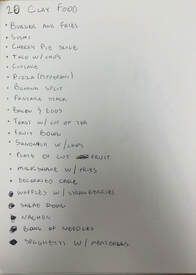
These are the 20 ideas for the clay food project.
|
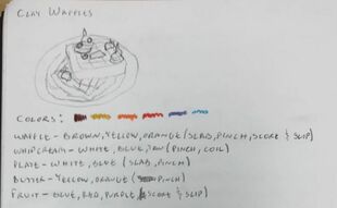
I chose 2 of the best ideas out of the 20. One of which was waffles with whip cream and fruit on a white plate. I chose the colors and techniques that will be used for each object.
|
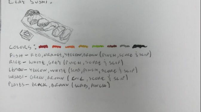
The other idea chosen was a row of sushi. This will have at least 4-3 sushi rolls with mainly fish and rice being visible. There will also be a wasabi dish. I also chose the colors and techniques for each object.
|
Molding Clay-
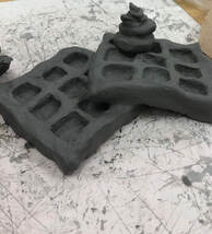
These are the waffles I shaped up. I used score and slip to mend them together. I also used coiling for the whipped cream.
|
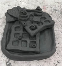
I added blueberries, a small slab of butter, as well as a plate, and strawberries. I used score and slip to mend the whipped cream, butter, and blue berries to the waffles. The plate was very bumpy and not very proportional so that will be changed.
|
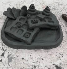
This is when I reshaped the plate to be smoother and more proportionate. The waffles and strawberries are also placed differently.
|
Painting- Practice and Project Clay
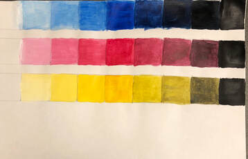
This is a value painting of primary colors using black and white to get different tones and shades of the color. The paint I used was acrylic.
|

This is similar to the value chart with the same type of paint. However, it is instead a color wheel using primary colors and black and white to create different shades of different colors. The colors that I started off from are red, yellow, green, cyan, blue, and magenta. I then worked off of those colors to make the rest of the wheel.
|
Evaluation of Famous Artist-
|
The Document to the left is a research of a famous painter named Franz Marc. It is an evaluation of his life and a couple of paintings he created and what their meaning are. Originally I was going to paint an inspired landscape view of two lions in a desert based on his own unique way of using colors, shapes, and cubism to create his paintings. However, there was no time to make it due to painting the clay first.
| ||
